
Western Governors University
Western Governors University (WGU) is a private, non-profit, online university based in Millcreek, Utah. The university uses an online competency-based learning model, providing advanced education for working professionals.
My intention for this section of my site is to share and document my experience throughout WGU’s Data Analytics Masters program.
This place will mostly be a dump of my thoughts and opinions on the courses required for completion of the program.
List of Courses
NOTE
D204 - The Data Analytics Journey
The Data Analytics Journey gives an overview of the entire analytics life cycle, covering terminology, tools, and techniques.
D204 - The Data Analytics Journey
Course Analysis
The first class in the MSDA program. It serves as mostly a “intro to” course that covers general concepts, the business context, and the fundamentals of the Data Analysis procedures.
For this class, there was a pre assessment that was available, so the first thing I did was take it to gain a sense of the topic being assessed as well as the type of questions that would be asked. On the first try, I failed with maybe only 2-3 questions missed from a passing grade. As for the course material, I went through it fairly quickly. Under the course materials there is a link to a LinkedIn course at the end of the course content, which was by far the most time intensive component of the course. After going through the LinkedIn videos, I retook the PA and passed with maybe 1-2 questions mised out of 60. Afterwards I went through the two recorded webinars, which was basically an hour review of the study guide found in the Course Chatter. However, in my personal opinion the study guide was the most helpful resource in understanding the course materials and what was needed for the Objective Assessment. The phases of the Data Analysis life cycle, the tools utilized, and other important concepts are covered in a table within the Study Guide. The translation to the life cycles found in the LinkedIn content is also included.
The next morning, I glanced over the study guide once more, took the PA one more time to see if I retained from the day before and scheduled the OA right after and passed.
Final Thoughts
Overall, I finished the course in about three days and would consider it fairly easy. This could be in part that I had a former knowledge of some of the concepts and tools before starting the course, most of it was a straightforward reminder. The OA questions were a bit challenging since many of them ask you to make assumptions rather than provide explicit answers based on what you learned in class. However, the PA is a useful benchmark for what to expect on the exam because it is unquestionably consistent with it in this regard. As for the exam in general it wasn’t too hard.
D205 - Data Acquisition
Data Acquisition builds proficiency in SQL and the initial stages of the data analytics lifecycle, introducing relational databases and data transference skills.
D205 - Data Acquisition
Course Analysis
D205 serves as basically an SQL refresher course. Upon starting, I realized I needed a refresher in SQL since my last encounter with it was during one of my database courses at George Mason, during my BSIT program. To brush up my skills, I opted for a course on DataCamp, a platform new to me. I was pleasantly surprised by their setup, which is quite similar to Udacity’s, featuring browser-based plugins. One part of the screen provided instructions while the other allowed me to interact with a PostgreSQL database, run queries, and practice commands. The course content served mostly as a review, but I did pick up a few new concepts. I appreciated the hands-on approach to writing SQL queries, and the lessons were of good quality, logical, and functioned smoothly. However, I would have preferred more exercises that required independent problem-solving rather than semi-completed code snippets.
When it came to the project work, the core tasks were straightforward. I chose not to install pgAdmin/postgres on my personal computer, relying instead on the lab environment provided, which presented its own set of challenges. Although I was new to pgAdmin, I found it quite user-friendly. However, I was a bit disappointed that DataCamp didn’t cover the pgAdmin GUI, and I wasn’t keen on searching for external resources to learn it—something I find frustrating about online courses when the necessary materials aren’t included.
Completing the class took me about 4 days. To be transparent, I found the DataCamp lessons quite a slog—not because of the content, but the format just didn’t sit well with me. Trying to complete numerous short lessons consecutively was incredibly tedious. Despite planning on dedicating a few hours each day, I only managed to cover a minimal amount of the course content. I often caught myself looking for distractions to avoid returning to the lessons—a rather inefficient way to spend my time.
Final Thoughts
While the course did offer me a good refresher on SQL and navigating an online database through pgAdmin 4, I was not a huge fan of the virtual lab environment. Should I have the chance to redo the process, with my existing SQL knowledge, I would opt for joining a cohort to get a grasp of the requirements and then dive straight into the practical assignment. For those new to SQL, the DataCamp format might not be as challenging to navigate. It’s possible that my prior experience was actually a hindrance, as I was seeking a review and decided to give it a shot. Unfortunately, it seems it wasn’t quite the right fit for me.
D206 - Data Cleaning
Data Cleaning continues building proficiency in the data analytics life cycle with data preparation skills, covering exploring, transforming, and imputing data.
D206 - Data Cleaning
Course Analysis
Starting this course I neglected the course materials for most of the class, assuming it would focus solely on data cleaning. However, I later realized this approach was flawed. The project also covered principal component analysis (PCA), a topic I was less acquainted with. I discovered that the class project guide, which I call the “secret” rubric, was much more instructive than the official one, which was too vague and sometimes misleading.
In contrast to previous courses where specific data issues were outlined for correction, this class left the identification of such problems to the students. In the churn dataset I worked with, I didn’t find any outliers that needed removal. This should be confirmed and documented the approach to handling missing values was left to my discretion, provided I could justify my methods. My strategy might have been unconventional, but it was effective enough to pass the performance assessment. The primary task was to correct columns with incorrect data types to ensure data consistency.
The data cleaning process was straightforward; however, the performance assessment demanded a meticulous breakdown of each step. For instance, it wasn’t enough to simply correct integer-formatted zip codes; I had to write code to pinpoint the problem, describe the solution, implement the fix, and then confirm the correction. This detailed segmentation of the workflow, which typically would be more iterative, felt unnatural and time-consuming, as it required extensive documentation for each fix rather than focusing on the practical aspect of resolving the issues.
The most demanding part of this performance assessment was undoubtedly the Principal Component Analysis (PCA) section at the end. PCA isn’t directly related to Data Cleaning, but it seems the course designers included it to broaden our analytical skills. I was unfamiliar with PCA, so this was a fresh learning curve for me. The course does touch upon PCA in Lesson 7, which could be beneficial to review. Dr. Middleton’s last lecture was particularly enlightening, offering a clear explanation of PCA and its coding within an hour—I skipped the Q&A session at the end. Additionally, Matt Brems’ article on Towards Data Science provided a thorough breakdown of PCA. In hindsight, the process was quite straightforward, especially with the code from Dr. Middleton’s lecture, but it was this new concept that initially slowed my progress.
Final Thoughts
The course was fairly decent overall. Dr. Middleton’s videos stood out as a highlight; they were excellent. However, the course falls short when it comes to the datasets provided. Having only engaged with the datasets twice, I already feel that not having a variety of datasets for different courses is a missed opportunity for students. It’s my concern that by the end of the degree, instead of showcasing a diverse portfolio of projects, we might end up with what feels like one extensive project that, while covering the full analytics lifecycle, could become repetitive and stale.
D207 - Exploratory Data Analysis
Exploratory Data Analysis covers statistical principles supporting the data analytics life cycle, including measures of central tendency, correlations, variation, and hypothesis testing.
D207 - Exploratory Data Analysis
Course Analysis
For this course, I ignored most of the class materials, except for the Data Camp unit on Performing Experiments in Python and was helpful in showing me how to execute various tests in Python.
The project involved using one of two datasets from a previous course, D206, which were only marginally cleaner. I reused my previous cleaning code, which turned out to be unnecessary since the data I needed was unchanged. My research question and hypotheses from D206 were also reused.
After a deep dive into Dr. Sewell’s webinar videos, which were a bit disorganized, I found the guidance I needed on chi-square tests of independence in Python. This allowed me to correctly analyze the data, although I had to resubmit the project again due to a citation oversight.
Once past the chi-square test, the rest was straightforward, albeit the project’s structure was a bit redundant, especially since my findings supported the null hypothesis, leading to a recommendation of no action.
For the univariate and bivariate statistics required in the performance assessment, I created graphs for each variable and included the necessary descriptive statistics, despite the rubric not being clear on this requirement. I also added brief discussions for each section, even though it wasn’t explicitly required, to provide context for the graphs.
After correcting my approach to the chi-square test and moving away from the unnecessary alternative tests, the project became relatively straightforward.
Final Thoughts
The structure of the project felt a bit disjointed, particularly with the insertion of variable exploration that seemed out of place. However, overall I throughouly enjoyed this course and learned quite a bit in terms of statistics and hypothesis testing for datasets.
D208 - Predictive Modeling
Predictive Modeling builds on data preparation and cleaning, enabling students to conduct logistic regression and multiple regression to model phenomena revealed by data.
D208 - Predictive Modeling
Course Analysis
Compared to previous courses, this course was a huge step up in difficulty and possible took me the longest to pass. The most valuable resources for me were Dr. Middleton’s two webinars. Unfortunately, I didn’t find Dr. Sewell’s lectures to be particularly useful, except for the slide on calculating the Variance Inflation Factor to check for multicollinearity. Additionally, Mark Keith’s succinct videos were instrumental in demonstrating the code for multiple linear regression and standardization. For Task 2, I revisited the webinars and also benefited from Susan Li’s thorough linear regression tutorial and Proteus’s guidance on calculating odds ratios.
Since both tasks required the use of datasets familiar from previous classes, I was able to repurpose my earlier data cleaning and exploratory analysis code. I limited myself to about 8 explanatory variables for my models. Creating bivariate visualizations was somewhat tedious, but my notes from a Data Visualization class at Udacity proved to be a lifesaver. For Task 2’s categorical y variable, I opted for mosaic plots to visualize categorical data relationships.
Task 1, involving multiple linear regression, went smoothly thanks to Mark Keith’s video. I refined my model by eliminating variables based on their Variance Inflation Factor and p-values. Analyzing the final model was straightforward, although I determined that despite its statistical significance, it lacked practical significance. Crafting residual plots was the only minor challenge, as they didn’t offer much insight.
Task 2 proved more challenging. While Susan Li’s tutorial was informative, it was more detailed than necessary for the project, which initially led me astray. A DataCamp unit from a subsequent class, D209, would have been more appropriate. After constructing my initial model with around 12 variables, I pared it down by assessing VIF and p-values. However, when it came to interpreting the confusion matrix, I hit a snag.
Final Thoughts
It seems this is the most extensive and challenging task of the program, encompassing two parts with an enormous scope. By ‘enormous,’ I’m referring to the level of tedium involved. A significant portion of this work involved creating histograms and bivariate graphs, similar to the previous class, and providing statistical measures such as medians, means, and modes where relevant. If there was one word to describe this course it would be Tedious. Seriously Tedious. However, I appreciated the difficuly of the course itself and would hope the continuing courses are just the same.
D209 - Data Mining I
Data Mining I expands predictive modeling into nonlinear dimensions, implementing supervised models for classification and prediction to unearth relationships among variables.
D209 - Data Mining I
Course Analysis
D209 felt like a continuation of D208, focusing on more predictive modeling with different techniques. Thanks to the helpful DataCamp videos, it seemed easier than D208.
The first project in D209 had us apply K-Nearest Neighbors (KNN) classification or Naive Bayes for predictive modeling. The second project required a similar approach but with decision trees, random forests, or advanced regression methods. Unlike other classes, D209 didn’t dictate the use of different data types for each task, allowing for consistency across projects.
My struggle with D208 Task 2 was a learning curve; my model’s poor performance wasn’t due to error but rather the data’s limitations for logistic regression. In D209, I experimented with different models for the same outcome variable, and by Task 2, I improved my model’s AUC score from 0.52 to 0.80—a satisfying progression.
For Task 1, I chose KNN classification to predict back pain using the medical dataset. The DataCamp unit on Machine Learning with scikit-learn was invaluable, and I wish I had it during D208. I refined my data preparation from previous classes and expanded my feature set. Dr. Elleh’s webinar was instrumental, particularly his code for SelectKBest, which I preferred over DataCamp’s method. It allowed me to choose features based on significance rather than just the top five.
I relied on the scikit-learn documentation for model specifics and Dr. Elleh’s webinar for guidance. DataCamp’s videos assisted with hyperparameter tuning and creating ROC AUC plots. I revisited my D208 Task 2 project for the classification report and confusion matrix, completing this project in just four days.
Task 2 led me to the DataCamp unit on Tree-Based Models in Python. I opted for a decision tree, which, while an improvement over the KNN model, was still a weak learner. This gave me the chance to apply Adaptive Boosting, enhancing the model’s performance. Most of the task involved fine-tuning the decision tree and booster, which was time-consuming due to my initial confusion over the balance between n_estimators and learning_rate.
Despite the lengthy tuning process, I managed to refine my model and complete the analysis. The rubric required calculating Mean Squared Error, which isn’t typically relevant for binary classification, but I complied. After addressing minor feedback regarding the explanation of decision trees and my expected outcomes I completed the final task required for this course.
Final Thoughts
Compared to D208, this class was relatively easy only taking me a 3-4 days to pass from start to finish. Everything I did was done in Jupyter Notebook with Python and Dr.Elleh’s webinar was the most helpful resources in understanding the task requirements.
D210 - Representation and Reporting
Representation and Reporting focuses on communicating observations and patterns to diverse stakeholders through data visualizations, audio representations, and interactive dashboards.
D210 - Representation and Reporting
Course Analysis
D210 was my introduction to data visualization with Tableau, a tool I hadn’t used before. In preparation for this course, I took Udemy’s Tableau 2022 A-Z: Hands-On Tableau Training for Data Science course . I completed the entire series and found the learning curve enjoyable. As a WGU student, I took advantage of the complimentary one-year Tableau Desktop license we receive. While I haven’t explored Tableau Prep Builder or pursued the Tableau Desktop Specialist certification yet, I plan to do so post-program, especially since we have free access to Tableau’s preparation materials and a discount on the certification exam.
The challenging part of D210 was finding a dataset to complement WGU’s offering. The difficulty was in finding a dataset to meaningfully join with it. I overthought this initially, but realized that any dataset with zip codes or states could work, even if the connection seemed superficial.
I chose the Telco sample customer churn data from Kaggle. My goal wasn’t to join but to compare similar columns from WGU’s and the Telco’s datasets, with a UNION operation. I tagged each dataset with a ‘Source’ identifier to distinguish between them in my analyses, allowing for comparative visualizations in Tableau without the need for a JOIN.
Creating the dashboard in Tableau was straightforward. I downloaded Tableau Public using my student license and worked from my PC. My approach was to experiment with a worksheet, then recreate it methodically once I understood the process through trial and error.
Final Thoughts
I managed to complete all the coursework for D210 within a week, wrapping up just in time for a long planned trip for me. My data preparation was conducted in Python, and I submitted my entire report, addressing all rubric criteria, through a Jupyter Notebook without any complications. This course was particularly enjoyable for me, as the DataCamp modules were well-constructed, and I had the opportunity to learn Tableau, a highly valuable tool. It’s regrettable that WGU doesn’t facilitate a Tableau certification, but given its affordability, I’m inclined to obtain it independently.
D211 - Advanced Data Acquisition
Advanced Data Acquisition enhances theoretical and SQL skills, covering advanced SQL operations, aggregating data, and acquiring data from various sources.
D211 - Advanced Data Acquisition
Course Analysis
This course operates in tandem with D210, utilizing Tableau Desktop to create dashboards for the churn/medical datasets, supplemented by an external dataset you select. The primary distinction in this course is the method of data importation; instead of a single CSV file, you’re tasked with uploading your data into a PostgreSQL database via a virtual machine using pgAdmin, then connecting Tableau to that database. This course proved to be more intricate than D210, largely due to the virtual machine work and several ambiguously written rubric components. Ambiguity in rubrics has been a recurring theme in this program, but this course exacerbated that issue.
For the external dataset, I continued with the Telco customer churn data I mentioned in D210. I bypassed the DataCamp courses, feeling confident in my pgAdmin skills from a previous course D205 and my familiarity with Tableau from D210. The performance assessment in this course doesn’t necessitate a complete Story in Tableau as D210 did, but rather a few dashboards. I simply replicated two dashboards from my D210 Story, using the same merged dataset I had compiled in D210.
Final Thoughts
The process of creating and preparing the combined dataset involves using pgAdmin and PostgreSQL, shifting away from Python or R. This wasn’t overly difficult, essentially translating the Python commands from my D210 project into PostgreSQL for D211. The virtual machine posed more of a hurdle than the coding itself.
D212 - Data Mining II
Data Mining II delves into advanced data mining techniques using Python, focusing on K-means clustering, Principal Component Analysis, and Market Basket Analysis.
D212 - Data Mining II
Course Analysis
This course is structured around three main tasks, each designed to build practical skills in different aspects of data mining:
Task 1: K-means Clustering
In this task, I learned about the K-means clustering technique, a foundational tool for identifying groups within a dataset based on similarity. The hands-on application involved segmenting data into distinct clusters to uncover patterns. This technique was pivotal in understanding market segmentation and customer grouping, providing insights into data structuring for further analysis.
Task 2: Principle Component Analysis
This task was our gateway to dimensional reduction methods. This task was instrumental in simplifying complex datasets by reducing the number of variables, yet retaining the essential information. By applying PCA, I could enhance the dataset’s interpretability without losing significant data, facilitating more efficient data analysis and visualization.
Task 3: Market Basket Analysis
The final task introduced me to Market Basket Analysis, a technique used to discover relationships between items in large datasets. Through this analysis, I learned to predict patterns and understand the co-occurrence of products purchased together. This knowledge is crucial for devising strategies in retail to optimize product placement, promotions, and inventory management.
Final Thoughts
Data Mining II was a rigorous and enlightening course that expanded my analytical skills and understanding of data mining’s critical role in organizational decision-making. The practical application of K-means clustering, PCA, and Market Basket Analysis through Python provided me with a solid foundation to tackle real-world data challenges. This course is a must for anyone looking to deepen their expertise in data mining and analytics.
D213 - Advanced Data Analytics
Advanced Data Analytics prepares students for career-long growth in advancing tools and techniques, covering machine learning, neural networks, randomness, and unconventional data sources.
D213 - Advanced Data Analytics
Course Analysis
This course is structured around three main tasks, each designed to build practical skills in different aspects of data mining:
Task 1: Time Series Analysis Using ARIMA
In this task, I learned about the K-means clustering technique, a foundational tool for identifying groups within a dataset based on similarity. The hands-on application involved segmenting data into distinct clusters to uncover patterns. This technique was pivotal in understanding market segmentation and customer grouping, providing insights into data structuring for further analysis.
Task 2: NLP Using TensorFlow/Keras
The second task introduced me to Natural Language Processing (NLP) with an emphasis on utilizing TensorFlow and Keras libraries. This task was a deep dive into the world of machine learning models for text processing, where I explored how to preprocess textual data, create word embeddings, and build neural network models to understand language patterns. The practical application of TensorFlow/Keras provided a solid foundation in managing, modeling, and interpreting large sets of textual data. It was an enlightening experience to see how NLP techniques can be leveraged to analyze and make predictions based on human language data.
Final Thoughts
Advanced Data Analytics is a comprehensive course that equips students with the knowledge and skills to navigate the rapidly evolving field of data analysis. Through hands-on tasks with ARIMA and NLP using TensorFlow/Keras, I gained invaluable insights into time series forecasting and natural language processing. This course has significantly enhanced my analytical toolkit, preparing me for the challenges and opportunities in data-driven industries.
D214 - Data Analytics Graduate Capstone
The Data Analytics Graduate Capstone allows students to apply academic and professional abilities developed as a graduate student, integrating skills from several program domains into one project.
D214 - Data Analytics Graduate Capstone
Course Analysis
This course is structured around three main tasks:
Task 1: Capstone Approval and Release Form
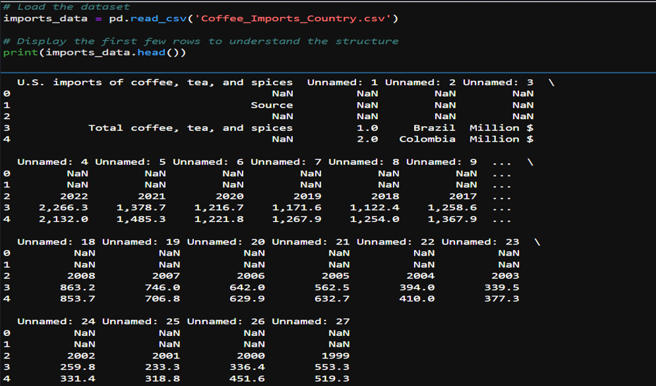
The majority of time for this task was revolved around finding a suitable topic for analysis that would be challenging and interesting, while also having a real world use case. I spent maybe several hours alone just looking into various datasets, mostly on Kaggle, downloading several and conducting EDA to attempt to find a dataset that I would like to work with for the entirety of the course. In the end I decided to settle on U.S. Food Imports Data sourced from United States Department of Agriculture. The dataset can be found here U.S. Food Imports.
Task 2: Data Analytics Report and Executive Suummary
For Task 2, we will define the Research Question and Hypothesis to test for the analysis of the US Foods Imports Data. In this task the following analysis steps will be performed: Data Collection, Data Extraction/Preparation and Exploratory Data Analysis.
Research Question and Hypothesis
Research Question: To what extent can the future import values of specific food commodities such as coffee, teas, and spices into the United States be predicted using time series forecasting models?
Hypothesis
- Null Hypothesis (H0): The import values of coffee, tea, and spices into the United States for the upcoming year cannot be predicted with an accuracy of 90% using the Mean Absolute Percentage Error (MAPE) as a metric for model performance.”
- Alternative Hypothesis (H1): The import values of coffee, tea, and spices into the United States for the upcoming year can be predicted with an accuracy of 90% or more using the Mean Absolute Percentage Error (MAPE) as a metric for model performance.
Data Collection
For this project I titled “Brewing Trends”, I obtained a comprehensive dataset from the United States Department of Agriculture (USDA). This dataset details the import values of various food commodities, including coffee, into the United States over the past 20 years. The data, structured annually, provides insights into the volume and value of food imports and includes key variables such as types of food commodities, year of import, the value of these imports in millions. The primary method of data collection was searching the internet for reliable sources of data such as government data. For this project, I used a dataset provided by the USDA, which can be found on their official website, as well as data.gov.
Data Extraction/Preparation
Objective of this step will be to extract and prepare the data for use in a time series analysis. Tools and Techniques used is as follows:
Python (Anaconda Environment):
- Usage: Served as the primary programming language for data manipulation and analysis.
- Advantage: Python offers extensive libraries and frameworks that simplify data analysis and model development. Examples include pandas, numpy, matplotlib, and sklearn.
- Disadvantage: Python can be less efficient in terms of execution speed compared to lower-level languages like C++.
Jupyter Notebook (Anaconda Environment):
- Usage: Jupyter Notebook provided an interactive environment for executing Python code, enabling real-time data manipulation and visualization.
- Advantage: It allows for an interactive coding environment with the ability to visualize data and outputs immediately.
- Disadvantage: Handling very large datasets in Jupyter Notebook can be cumbersome and may lead to performance issues.
Libraries Used:
- Pandas: Utilized for data cleaning, manipulation, and analysis. It was instrumental in reformatting the original dataset into a more analyzable format.
- NumPy: Will be used for numerical computations, especially useful in manipulating arrays and performing mathematical operations.
- Matplotlib: Intended for visualizing data, important for understanding data trends and patterns essential for time series forecasting.
- Scikit-learn (Sklearn): To be used for implementing machine learning models, particularly time series forecasting models.
Data Cleaning
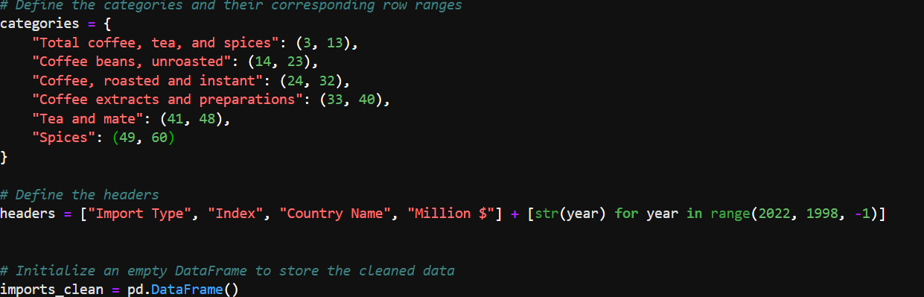
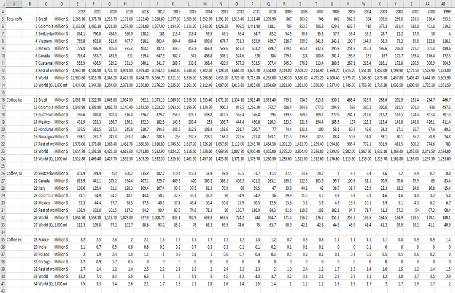
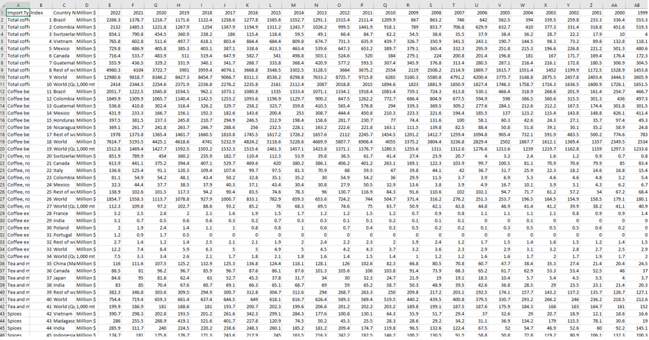
- The dataset initially contained irrelevant and misplaced rows and columns.
- Specific rows were identified and selected based on the category they represented (e.g., “Total coffee, tea, and spices”).
- Numeric values were cleaned by removing commas and converting strings to numeric data types.
- Initial imports
- Load Dataset into Data frame
- Defining Categories and Headers
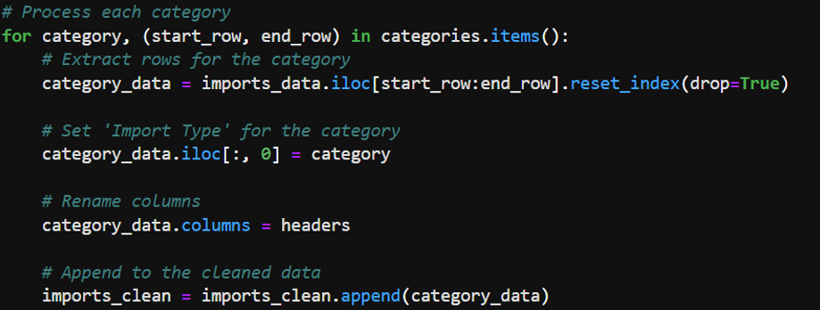
- Processing Categories and Appending New Data
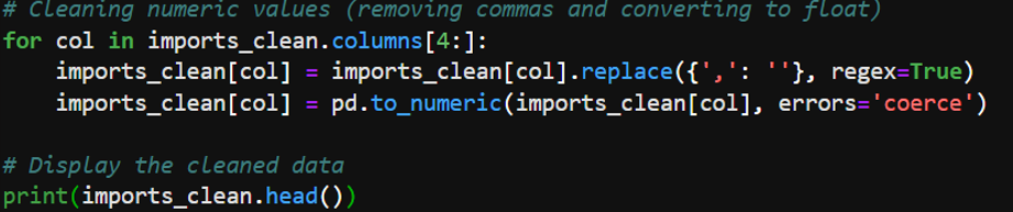
- Cleaning Numeric Values
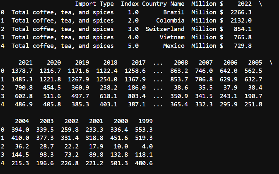
- Cleaning Before and After
Exploratory Data Analysis
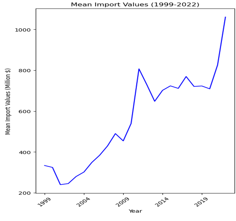
Mean Import Data
- Overall Trend: There is a clear upward trend in the mean import values over the observed period. This suggests an increase in the average value of imports entering the U.S. over time for the commodities being analyzed.
- Periodic Fluctuations: Despite the overall upward trend, there are periods of fluctuation where mean values dip and rise. Notably, there are dips around the early 2000s, mid-2000s, and early 2010s.
- Notable Dips: After a pronounced dip around 2008, which could be attributed to the global financial crisis, there is a significant growth in mean import values peaking around 2011 before another dip.
- Economic Indicators: The exact reasons for the fluctuations and growth could be numerous, including changes in global market demand, price changes of commodities, trade policies, and economic conditions.
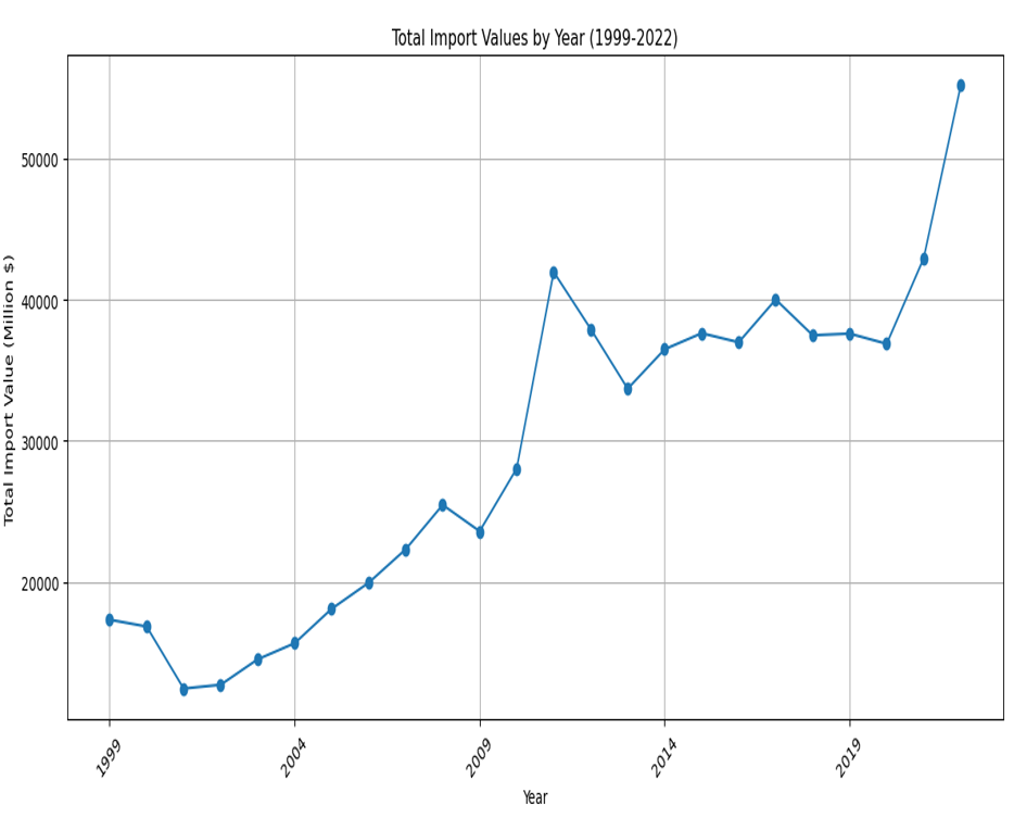
Total Imports
- Overall Trend: The chart shows a general upward trend in total import values over the given time period, indicating an increase in the value of imports.
- Periodic Fluctuations: There are noticeable year-to-year variations in import values, with certain years experiencing significant increases or decreases compared to adjacent years.
- Notable Dips: There are notable dips in the graph, particularly after the years 2000 and 2008, which may correspond to economic downturns, such as the dot-com bubble burst and the global financial crisis.
- Economic Indicators: This upward trajectory, particularly in the latter years, could be influenced by a variety of factors, such as increased demand, inflation, changes in trade policies, or other economic conditions.
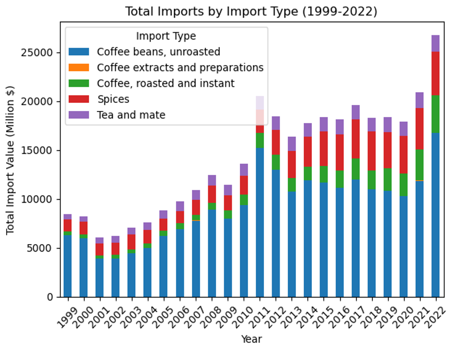
Imports by Import Types
- Overall Trend: The chart generally indicates a rising trend in total import values over the years. This suggests an increase in the U.S. demand for these commodities or a rise in their prices, or both.
- Import Variability: There is variability in the proportional contribution of each category to the total imports. Some categories, such as unroasted coffee beans, show a consistent presence over the years, while others fluctuate more noticeably.
- Notable Increases: There is a pronounced increase in the total import values in the final year, 2022, which is significantly higher than any other year. This could be due to a variety of factors, including market dynamics, changes in trade policies, or economic inflation.
- Economic Indicators: While the overall trend is upward, there are fluctuations from year to year. Some years show a decrease or plateau in total imports, indicating potential economic cycles or changes in industry patterns.
Statistical Analysis and Modeling
- Aggregate Total Imports by Year: For the time series analysis, I chose to use data aggregated on an annual basis. This data represents the total import values of the specified commodities, chosen because annual aggregation captures the long-term trends and seasonality while filtering out short-term fluctuations.
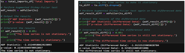
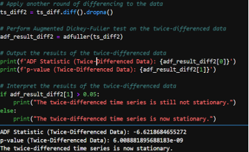
- Stationarity Check: Using the Augmented Dickey-Fuller (ADF) test, I checked if the time series data is stationary. The data required two rounds of differencing in order to meet the stationarity check requirements. After differencing the data twice, we get an ADF statistic of -6.62 and a very small p-value. As a result, we can confidently reject the null hypothesis that the series has a unit root and conclude that the twice-differenced time series is stationary.
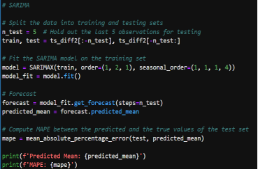
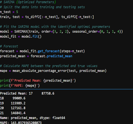
SARIMA Modeling
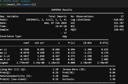
- Initial SARIMA Model: A SARIMA model was initially fit to the data. However, the Mean Absolute Percentage Error (mape) from this model was high, suggesting that the model was not capturing the underlying data patterns effectively.
- Fine-Tuning SARIMA Parameters: Using the auto_arima function from the pmdarima package, I automated the process of selecting the best-fitting SARIMA model parameters. This tool iteratively explores various combinations of parameters to find the best model based on the lowest AIC or BIC.
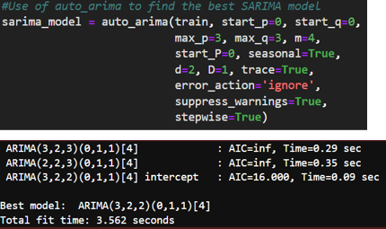
- Optimized SARIMA Model: The optimized SARIMA model, as suggested by auto_arima, used a combination of non-seasonal and seasonal parameters that were expected to improve the model fit. Despite optimization, the resulting MAPE was still higher than the acceptable threshold, indicating that while the model performance improved, it was not sufficiently accurate for the project’s standards.
Prophet Modeling
- Prophet Model: Due to the SARIMA model not performing as expected, with a higher than acceptable MAPE, the Prophet model was selected for further analysis. Prophet is renowned for its flexibility in managing the seasonality and trend components of a time series, as well as its resilience to missing data and outliers. The dataset was prepared for use with Prophet, which required a DataFrame with two columns: ‘ds’ for the timestamp and ‘y’ for the metric being forecasted. The data was filtered for the relevant years and formatted to meet Prophet’s specifications.
- Initial Prophet Model (1999-2022): The initial model was trained using data spanning from 1999 to 2022. The model was set up with yearly seasonality enabled to capture any annual patterns in the import data. The resulting MAPE was 14.49%, which was above the threshold needed to consider the model highly accurate for the project’s purposes.
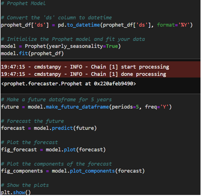
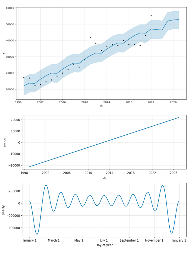
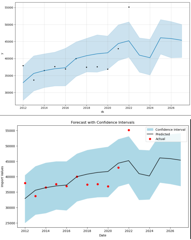
- Refined Prophet Model (2012-2022): Given the high MAPE, a decision was made to refine the analysis by focusing on data from 2012 to 2022. This period was chosen to potentially exclude any anomalous effects from global events that occurred before 2012, which could include the financial crisis of 2008 and other disruptions that may not be representative of future trends. The refined Prophet model provided a MAPE of approximately 8.83%, indicating a better fit and suggesting increased predictive accuracy for this time frame. Confidence intervals were also generated to express the uncertainty in the forecasts. The visualizations included both 80% and 95% confidence intervals, providing a range within which future values are likely to fall. These intervals are crucial for risk assessment and decision-making as they convey the range of possible outcomes and the level of certainty associated with the forecasts.
Analysis Conclusion
The Prophet model’s use for the years 2012-2022 appears to be justified, with improved accuracy as indicated by the lower MAPE value. The second Prophet model’s performance suggests that it could be a reliable tool for forecasting future import values of coffee, tea, and spices into the United States, considering the possible exclusion of earlier global events that might distort the predictive modeling.
- SARIMA: SARIMA was chosen for its capacity to model both non-seasonal and seasonal time series data. This method is particularly suitable for data with trends and patterns that repeat over a fixed period, which is often the case with import data due to cyclical economic activities and seasonal demand patterns.
- Prophet: Prophet was selected due to its robustness to missing values and outliers and its ability to handle the seasonality and trend components of a time series with potentially non-linear growth trends, as might be seen in import data influenced by a variety of economic factors.
Task 3: Executive Summary and Implications
The executive summary for this project can be found here: Executive Summary.